Skip to navigation
Skip to main content
About Us
Our Partners
Work With Us
Suivi de Commande
Contactez nous
FAQs
Rechercher
Support 24/7
+33 6 44 68 81 50
0
items
0,00
€
Menu
Login / Register
Nos catégories
Gros électroménager
Micro-ondes encastrable
Sèche-linge
Micro-ondes
Congélateur
Climatiseur
Aspirateur robot
Petit électromenager
Piano de cuisson induction
Machine à café encastrable
Airfryer
Aspirateur balai
Cuisinière induction
Accueil
Notre Boutique
Suivi de Commande
Liste des favoris
Contactez nous
0
Liste de favoris
Login / Register
Rechercher
ELECTROLUX
Accueil
ELECTROLUX
Page 3
Affichage de 41–59 sur 59 résultats
Show sidebar
Afficher
9
12
18
24
Tri par défaut
Tri par popularité
Tri par notes moyennes
Tri du plus récent au plus ancien
Tri par tarif croissant
Tri par tarif décroissant
-25%
Quick view
Ajouter aux favoris
Ajouter au panier
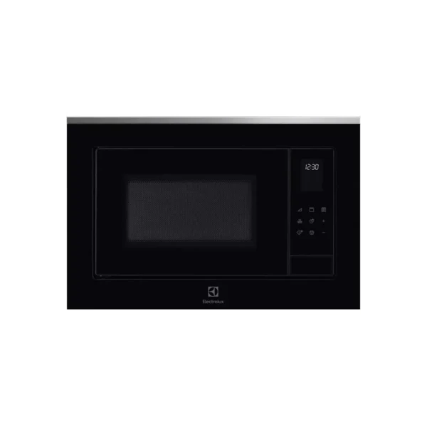
Micro ondes grill encastrable ELECTROLUX LMS4253TMX
Cuisine et cuisson
,
Micro-ondes
,
Micro-ondes encastrable
527,00
€
Le prix initial était : 527,00 €.
396,00
€
Le prix actuel est : 396,00 €.
-28%
Quick view
Ajouter aux favoris
Ajouter au panier
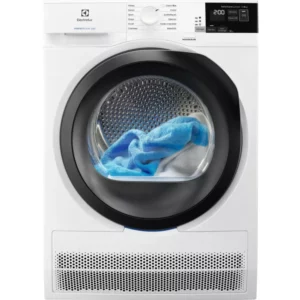
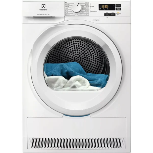
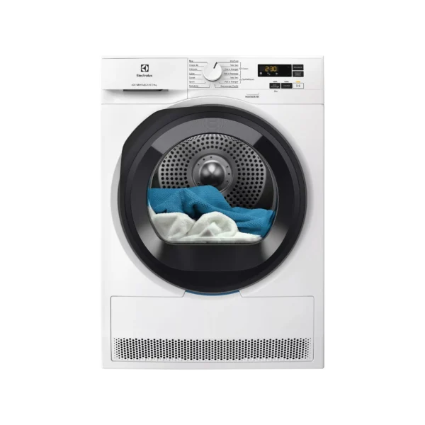
Sèche linge à condensation ELECTROLUX EW6C4089DD
Gros électroménager
,
Sèche-linge
550,00
€
Le prix initial était : 550,00 €.
395,00
€
Le prix actuel est : 395,00 €.
-23%
Quick view
Ajouter aux favoris
Ajouter au panier
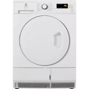
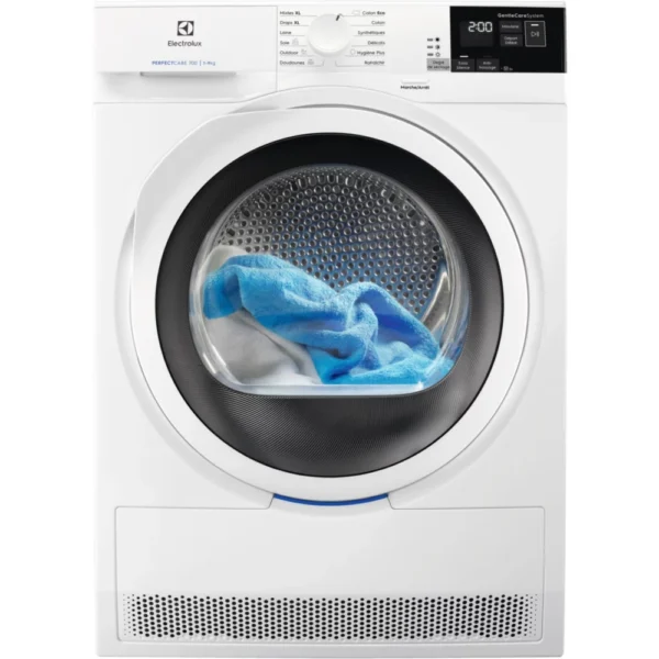
Sèche linge à condensation ELECTROLUX EW6C4723SC
Gros électroménager
,
Sèche-linge
500,00
€
Le prix initial était : 500,00 €.
385,00
€
Le prix actuel est : 385,00 €.
-22%
Quick view
Ajouter aux favoris
Ajouter au panier
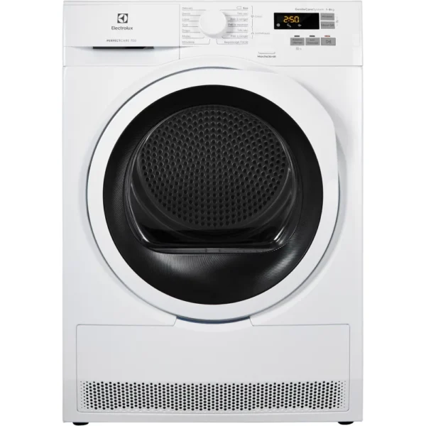
Sèche linge pompe à chaleur ELECTROLUX EW6HI6184DB
Gros électroménager
,
Sèche-linge
699,00
€
Le prix initial était : 699,00 €.
545,00
€
Le prix actuel est : 545,00 €.
-23%
Quick view
Ajouter aux favoris
Ajouter au panier
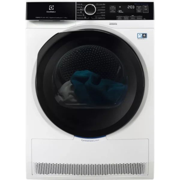
Sèche linge pompe à chaleur ELECTROLUX EW7H4936AB
Gros électroménager
,
Sèche-linge
760,00
€
Le prix initial était : 760,00 €.
587,00
€
Le prix actuel est : 587,00 €.
-22%
Quick view
Ajouter aux favoris
Ajouter au panier
Sèche linge pompe à chaleur ELECTROLUX EW7H5142SC
Gros électroménager
,
Sèche-linge
700,00
€
Le prix initial était : 700,00 €.
545,00
€
Le prix actuel est : 545,00 €.
-16%
Quick view
Ajouter aux favoris
Ajouter au panier
Sèche linge pompe à chaleur ELECTROLUX EW8HI595BG
Gros électroménager
,
Sèche-linge
899,00
€
Le prix initial était : 899,00 €.
754,00
€
Le prix actuel est : 754,00 €.
-19%
Quick view
Ajouter aux favoris
Ajouter au panier
Sèche linge pompe à chaleur ELECTROLUX EW9H2923PC
Gros électroménager
,
Sèche-linge
730,00
€
Le prix initial était : 730,00 €.
589,00
€
Le prix actuel est : 589,00 €.
-23%
Quick view
Ajouter aux favoris
Ajouter au panier
Sèche linge pompe à chaleur ELECTROLUX EWHI619G5BO
Gros électroménager
,
Sèche-linge
649,99
€
Le prix initial était : 649,99 €.
500,00
€
Le prix actuel est : 500,00 €.
-10%
Quick view
Ajouter aux favoris
Ajouter au panier
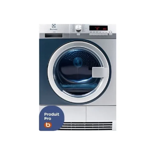
𝐒𝐞̀𝐜𝐡𝐞 𝐥𝐢𝐧𝐠𝐞 𝐩𝐫𝐨𝐟𝐞𝐬𝐬𝐢𝐨𝐧𝐧𝐞𝐥 𝐄𝐋𝐄𝐂𝐓𝐑𝐎𝐋𝐔𝐗 𝐦𝐲𝐏𝐑𝐎 𝐓𝐄𝟏𝟏𝟐𝟎
Gros électroménager
,
Sèche-linge
1 499,00
€
Le prix initial était : 1 499,00 €.
1 342,00
€
Le prix actuel est : 1 342,00 €.
-11%
Quick view
Ajouter aux favoris
Ajouter au panier
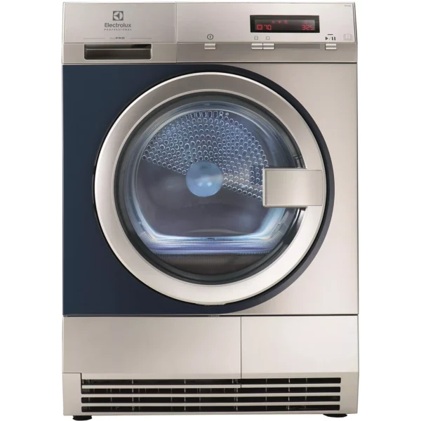
Sèche linge professionnel ELECTROLUX myPro TE1120P ZIP monnayeur
Gros électroménager
,
Sèche-linge
1 790,00
€
Le prix initial était : 1 790,00 €.
1 590,00
€
Le prix actuel est : 1 590,00 €.
-30%
Quick view
Ajouter aux favoris
Ajouter au panier
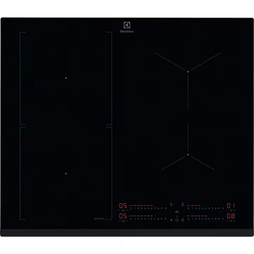
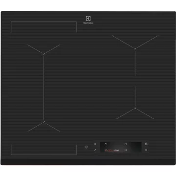
Table induction ELECTROLUX EIS62453 SenseBoil
Piano de cuisson
,
Plaque induction
600,00
€
Le prix initial était : 600,00 €.
420,00
€
Le prix actuel est : 420,00 €.
-34%
Quick view
Ajouter aux favoris
Ajouter au panier
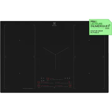
Table induction ELECTROLUX EIS6648 SensePro
Piano de cuisson
,
Plaque induction
1 200,00
€
Le prix initial était : 1 200,00 €.
798,00
€
Le prix actuel est : 798,00 €.
-40%
Quick view
Ajouter aux favoris
Ajouter au panier
Table induction ELECTROLUX EIS67483
Plaque induction
1 000,00
€
Le prix initial était : 1 000,00 €.
602,00
€
Le prix actuel est : 602,00 €.
-31%
Quick view
Ajouter aux favoris
Ajouter au panier
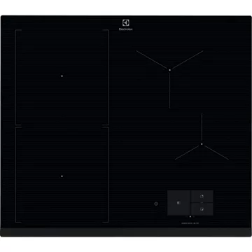
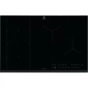
Table induction ELECTROLUX EIS8648 SensePro Serie 900
Plaque induction
1 400,00
€
Le prix initial était : 1 400,00 €.
960,00
€
Le prix actuel est : 960,00 €.
-33%
Quick view
Ajouter aux favoris
Ajouter au panier
Table induction ELECTROLUX EIS87553IZ SaphirMatt
Plaque induction
1 200,00
€
Le prix initial était : 1 200,00 €.
805,00
€
Le prix actuel est : 805,00 €.
-29%
Quick view
Ajouter aux favoris
Ajouter au panier
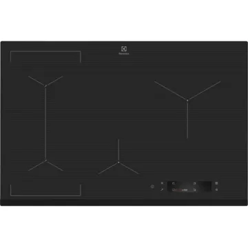
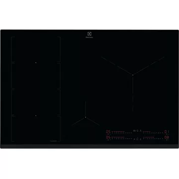
Table induction ELECTROLUX EIV854 H2H FLEX
Plaque induction
700,00
€
Le prix initial était : 700,00 €.
500,00
€
Le prix actuel est : 500,00 €.
-33%
Quick view
Ajouter aux favoris
Ajouter au panier
Table induction ELECTROLUX EIV85456 Flex
Plaque induction
900,00
€
Le prix initial était : 900,00 €.
605,00
€
Le prix actuel est : 605,00 €.
-32%
Quick view
Ajouter aux favoris
Ajouter au panier
Table induction ELECTROLUX EIV95550 Flex90 H2H
Plaque induction
1 200,00
€
Le prix initial était : 1 200,00 €.
812,00
€
Le prix actuel est : 812,00 €.
Rechercher
Menu
Categories
Gros électroménager
Micro-ondes encastrable
Sèche-linge
Micro-ondes
Congélateur
Climatiseur
Aspirateur robot
Petit électromenager
Piano de cuisson induction
Machine à café encastrable
Airfryer
Aspirateur balai
Cuisinière induction
Accueil
Notre Boutique
Suivi de Commande
Liste des favoris
Contactez nous
Liste de favoris
Login / Register
Panier
Fermer
Menu
Filters
0
Liste de favoris
0
items
Cart
Mon compte